728x90
반응형
SMALL
Front-End 개발을 해보신 분이라면 한번쯤은 들어봤을만한 플렉스 개구리(https://flexboxfroggy.com/#ko) 입니다.
공략을 보지 않고도 충분히 해결 할 수 있지만, 해답이 먼저 궁금하신 분들은 참고해 보신 다음, 따라 해 보면 도움되실것 같아요.
1단계.
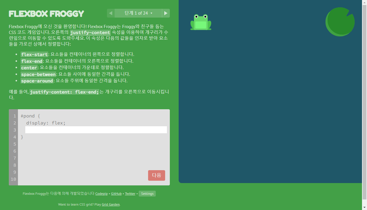
답)
justify-content: flex-end;
2단계.
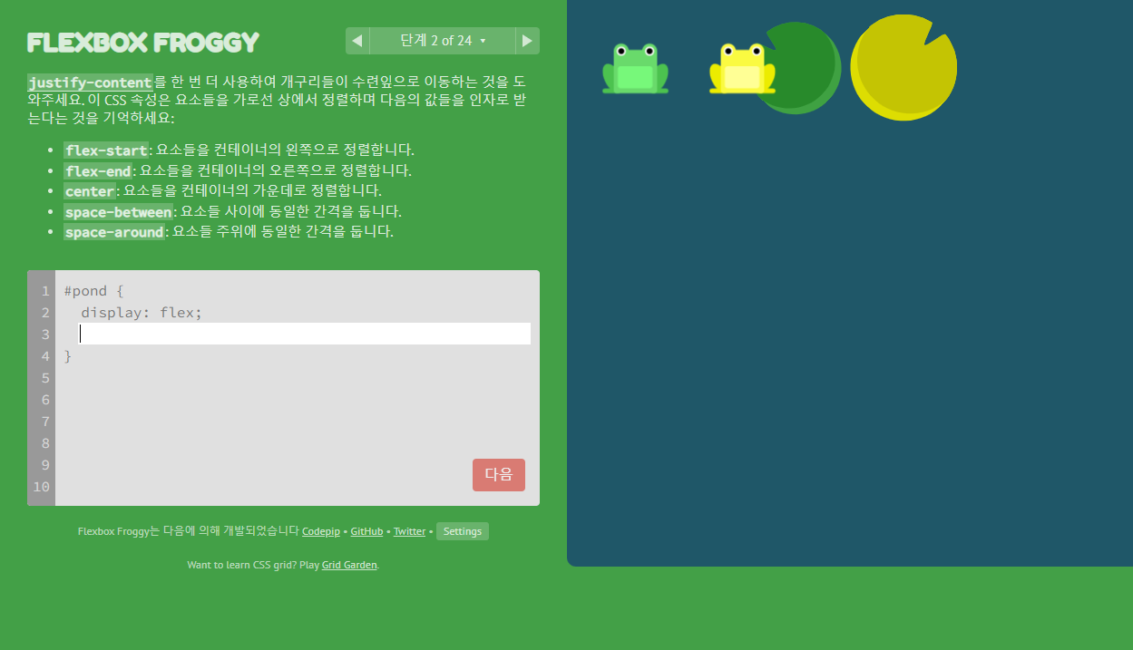
답)
justify-content: center;
3단계.
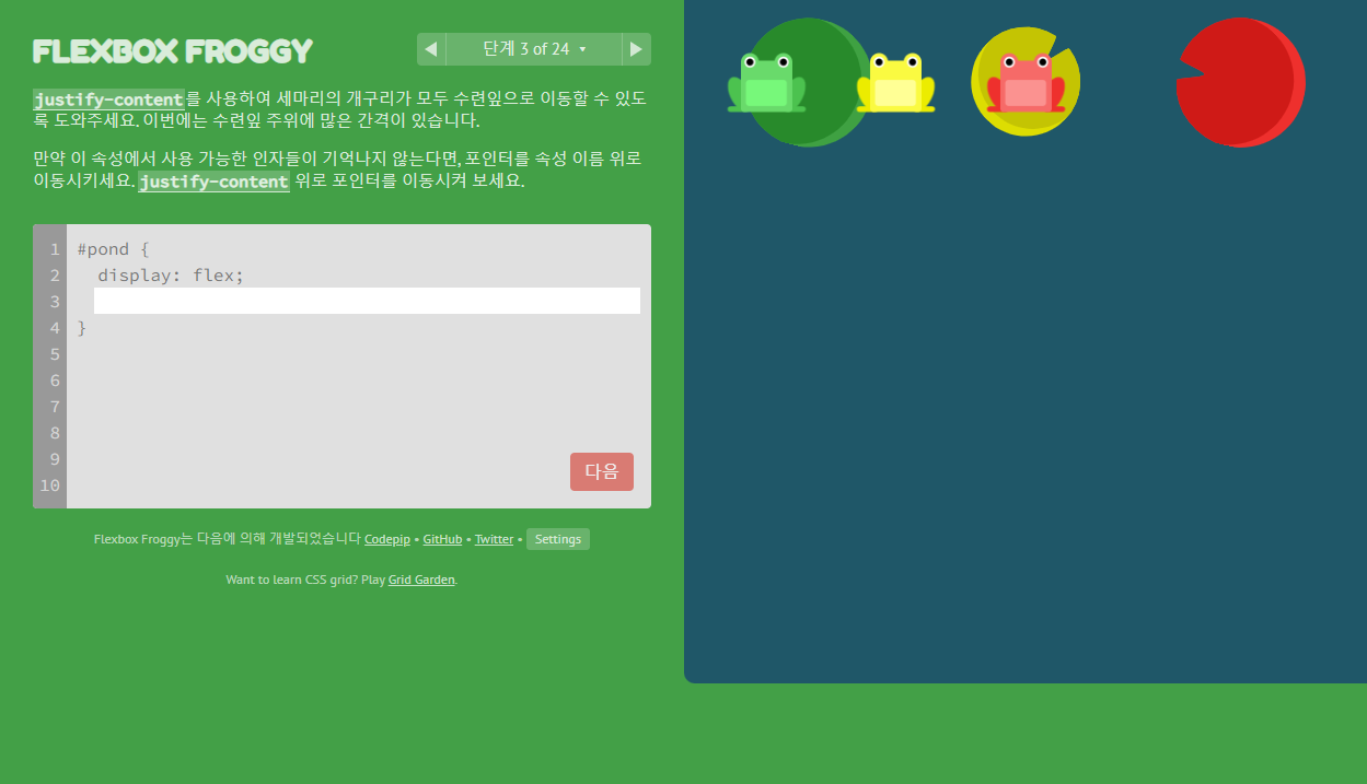
답)
justify-content: space-around;
4단계.

답)
justify-content: space-between;
5단계.
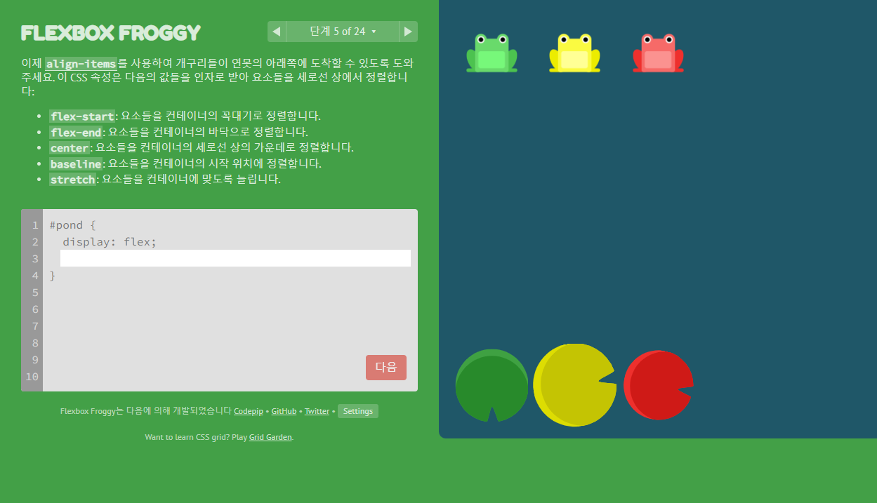
답)
align-items: flex-end;
6단계.
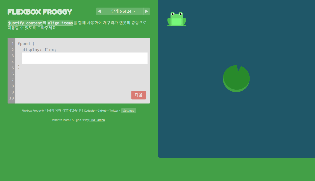
답)
justify-content: center;
align-items: center;
7단계.
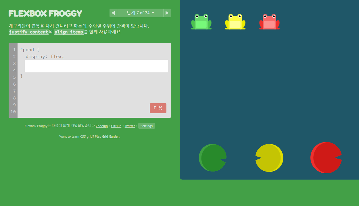
답)
justify-content: space-around;
align-items: flex-end;
8단계.

답)
flex-direction: row-reverse;
9단계.
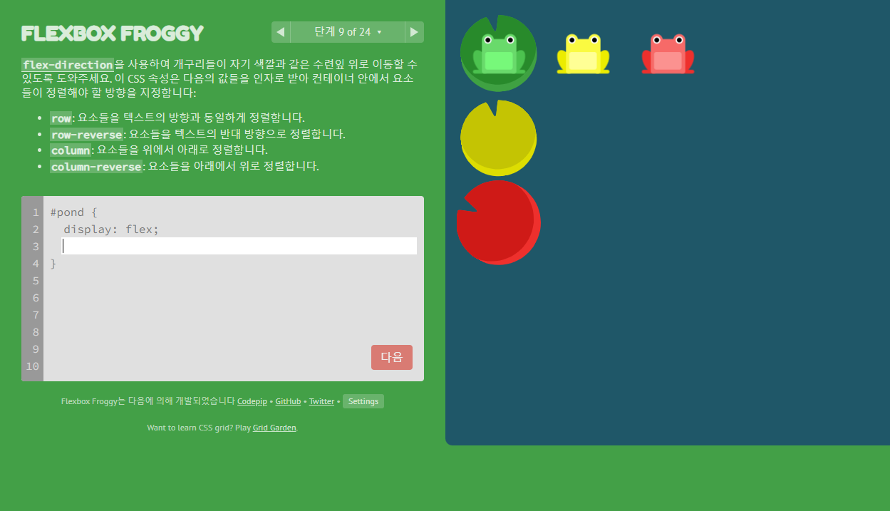
답)
flex-direction: column;
10단계.
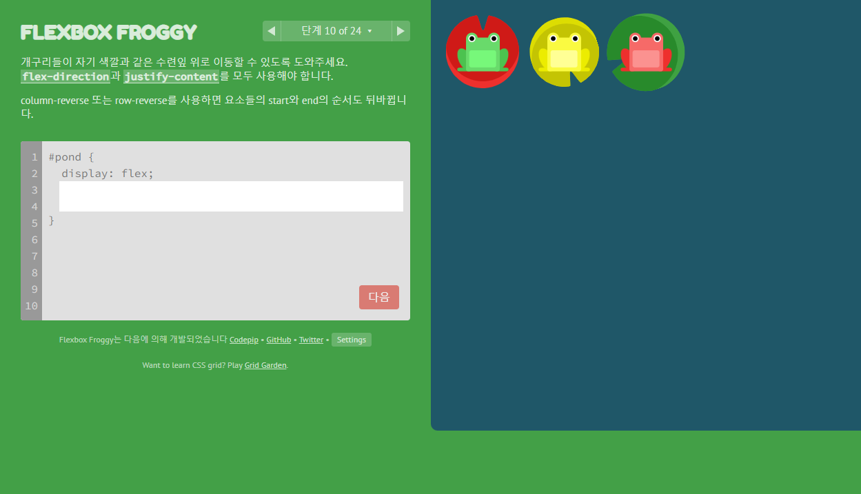
답)
flex-direction:row-reverse;
justify-content: flex-end;
11단계.
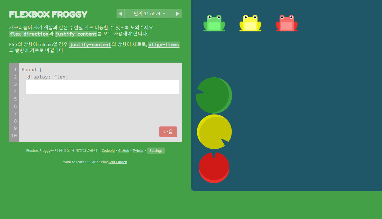
답)
flex-direction: column;
justify-content: flex-end;
12단계.
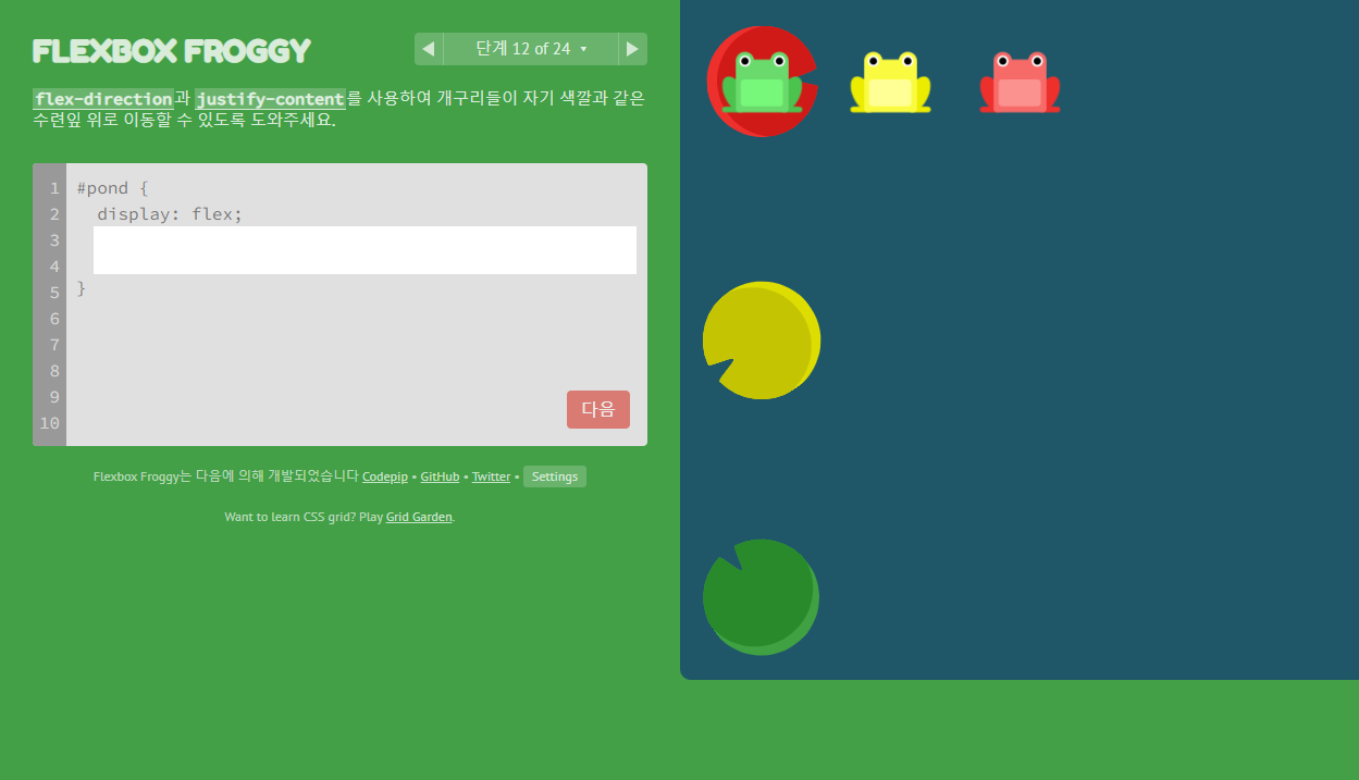
답)
flex-direction: column-reverse;
justify-content: space-between;
13단계.
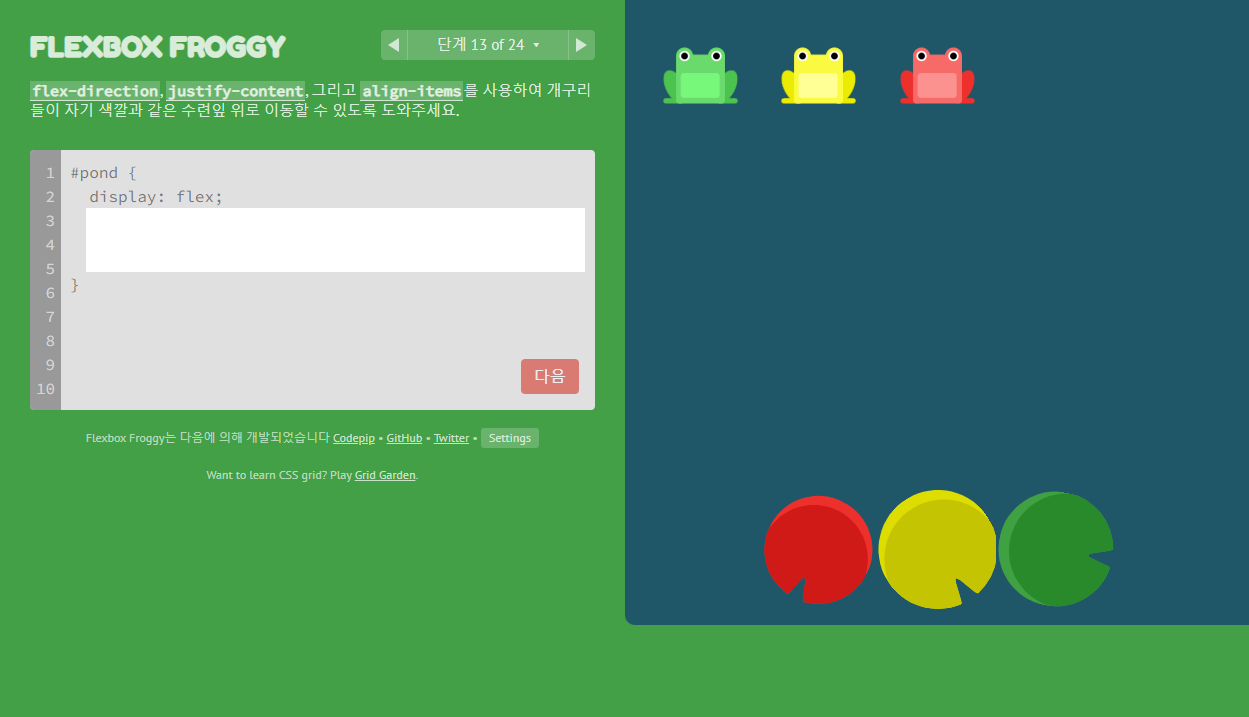
답)
flex-direction: row-reverse;
align-items: flex-end;
justify-content: center;
14단계.

답)
order: 1;
15단계.
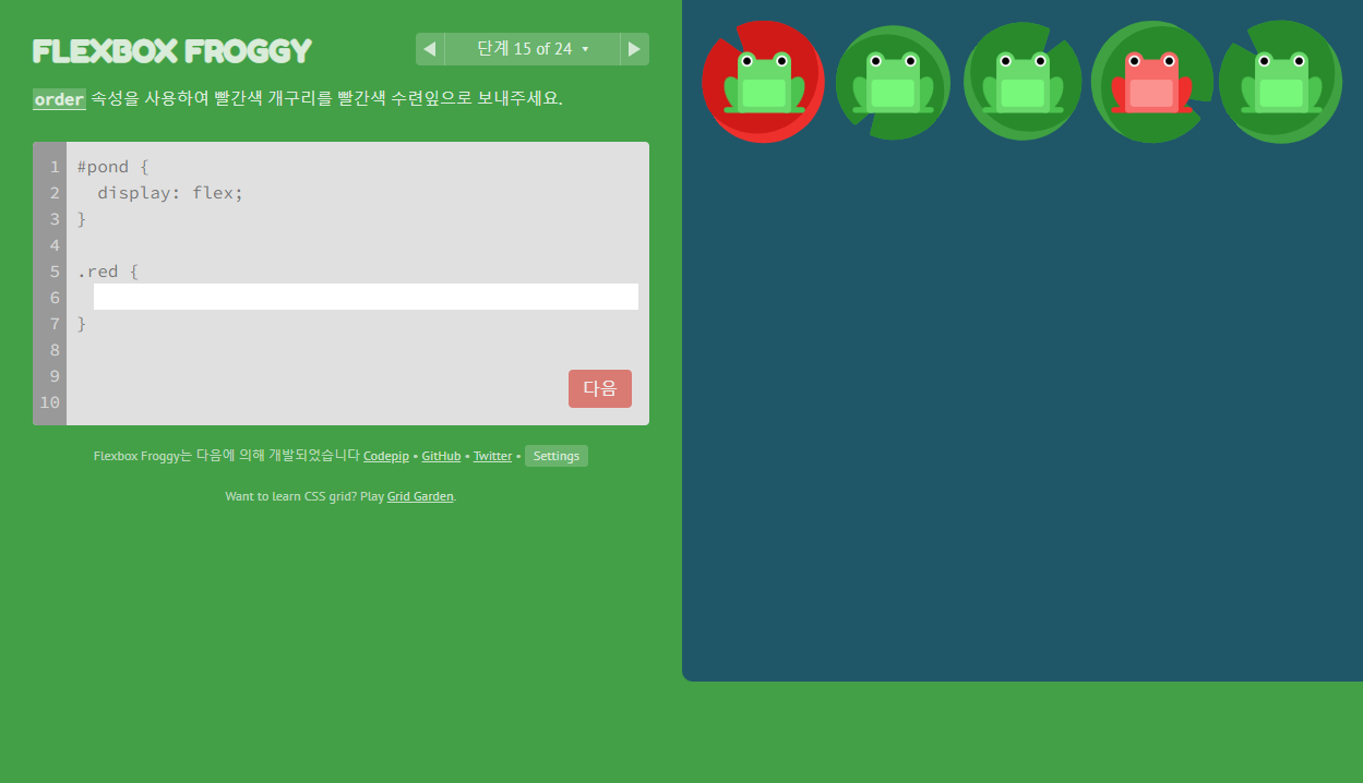
답)
order: -1;
16단계.
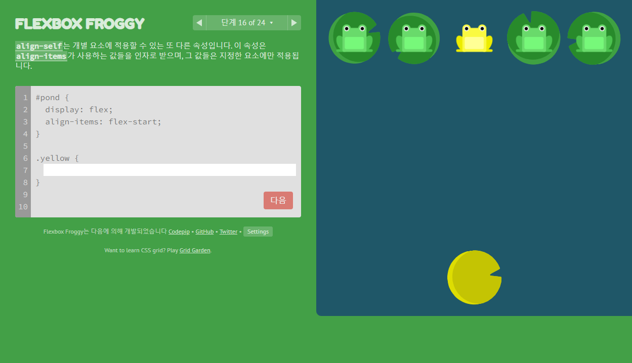
답)
align-self: flex-end;
17단계.

답)
order: 1;
align-self: flex-end;
18단계.

답)
flex-wrap: wrap;
19단계.

답)
flex-direction: column;
flex-wrap: wrap;
20단계.

답)
flex-flow: column wrap;
21단계.
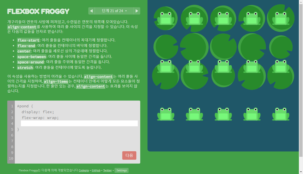
답)
align-content: flex-start;
22단계.
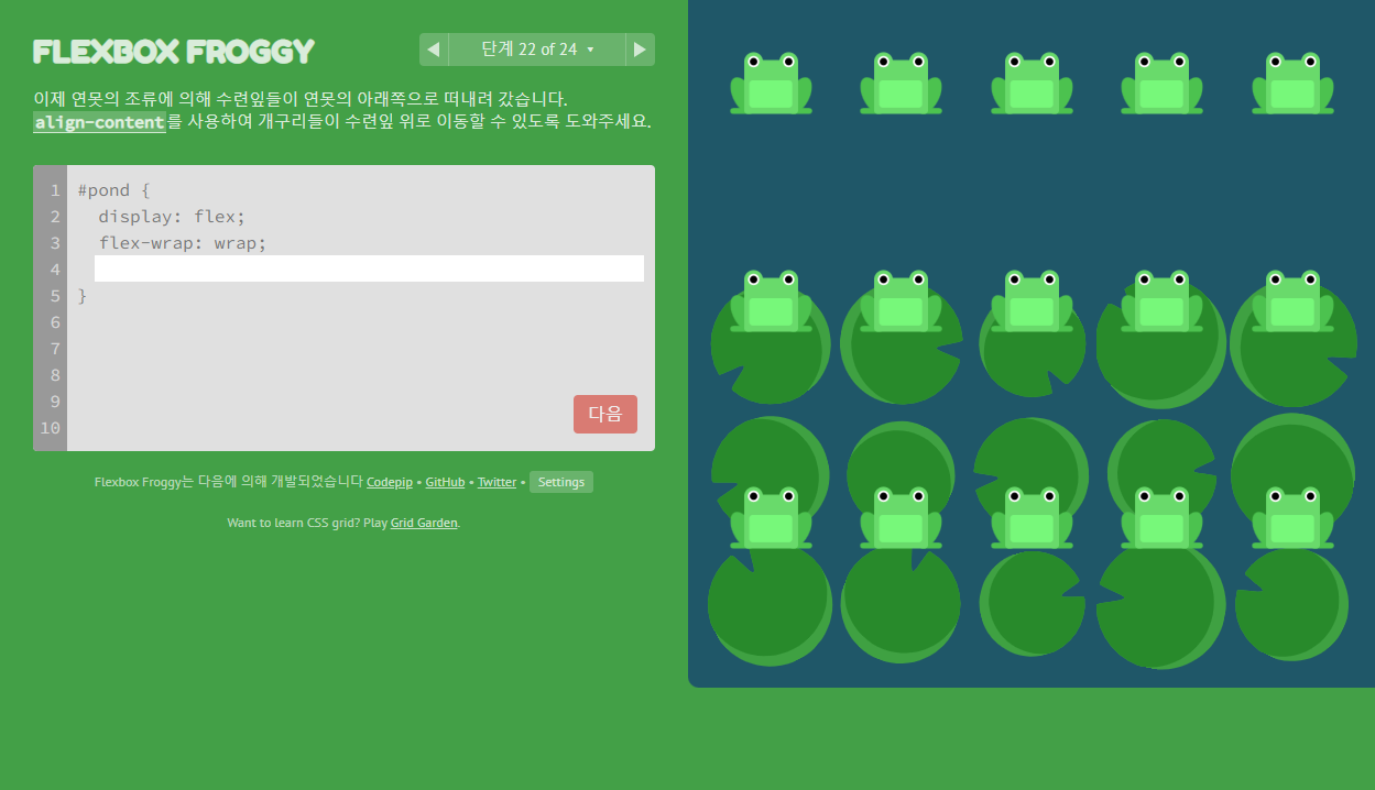
답)
align-content: flex-end;
23단계.

답)
flex-direction: column-reverse;
align-content: center;
24단계.
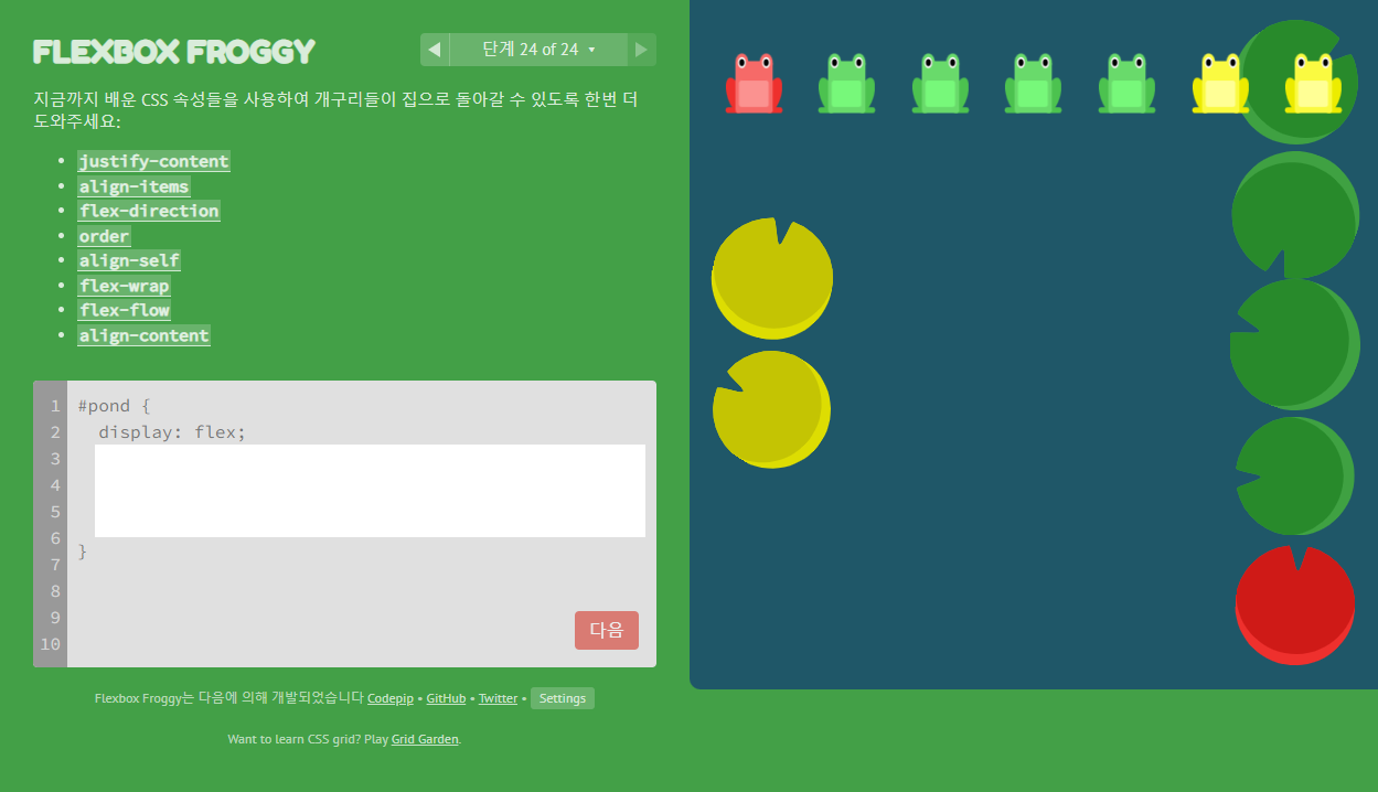
답)
flex-flow: column-reverse wrap-reverse;
justify-content: center;
align-content: space-between;
Finish!!

728x90
반응형
LIST
댓글